
In the second post in this series on Python for Mechanical Engineers, we’ll do an example calculation to show the flexibility of Python and Jupyter labs. You can follow this tutorial with the code available on github.
1. Problem Definition
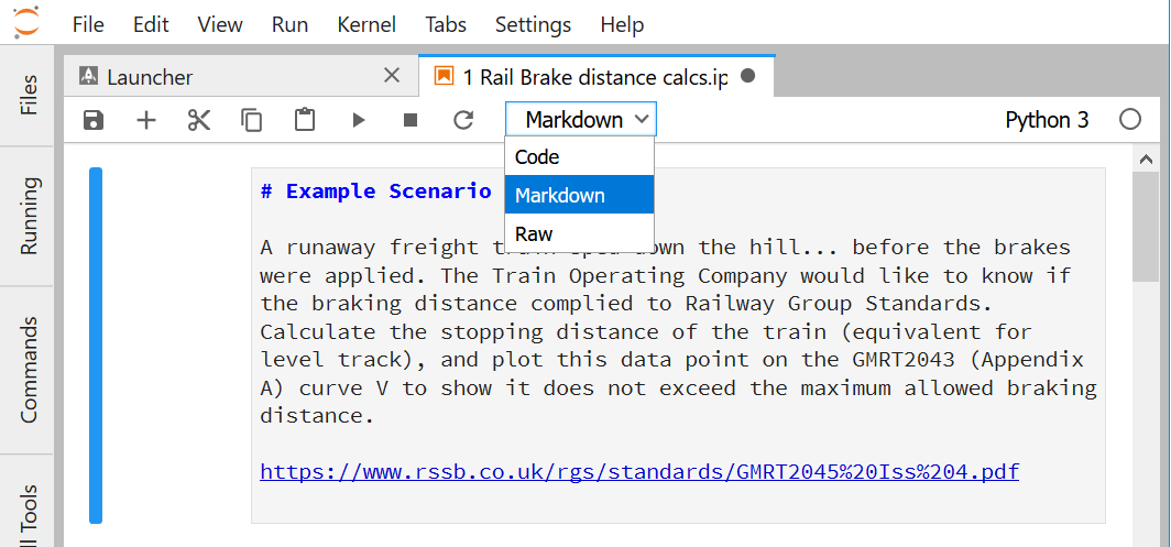
A runaway freight train sped down the hill… before the brakes were applied. The Train Operating Company would like to know if the braking distance complied to Railway Group Standards.
Calculate the stopping distance of the train (equivalent for level track), and plot this data point on the GMRT2043 (Appendix A) curve V to show it does not exceed the maximum allowed braking distance.
https://www.rssb.co.uk/rgs/standards/GMRT2045%20Iss%204.pdf
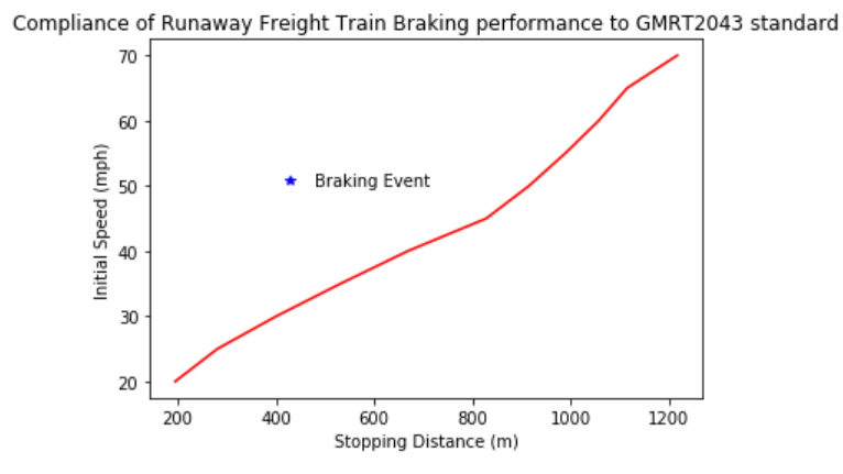
Curve V data defined in GMRT2043 Appendix A:
CURVEV_INITIAL_SPEED = [20, 25, 30, 35, 40, 45, 50, 55, 60, 65, 70] # units: mph
CURVEV_DISTANCE = [195, 281, 401, 532, 669, 829, 916, 990, 1058, 1116, 1218] # units: metres
Data discovered from Onboard Train Monitoring Recorder:
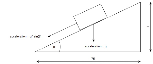
SPEED_1 = 82 # speed at start of brake application (km/h)
SPEED_2 = 0 # speed at end of brake application (km/h)
TIME_1 = 0
TIME_2 = 34
DISTANCE_1 = 3295120 # distance at start of brake application (m)
DISTANCE_2 = 3295665 # distance at end of brake application (m)
GRADIENT = 1/75
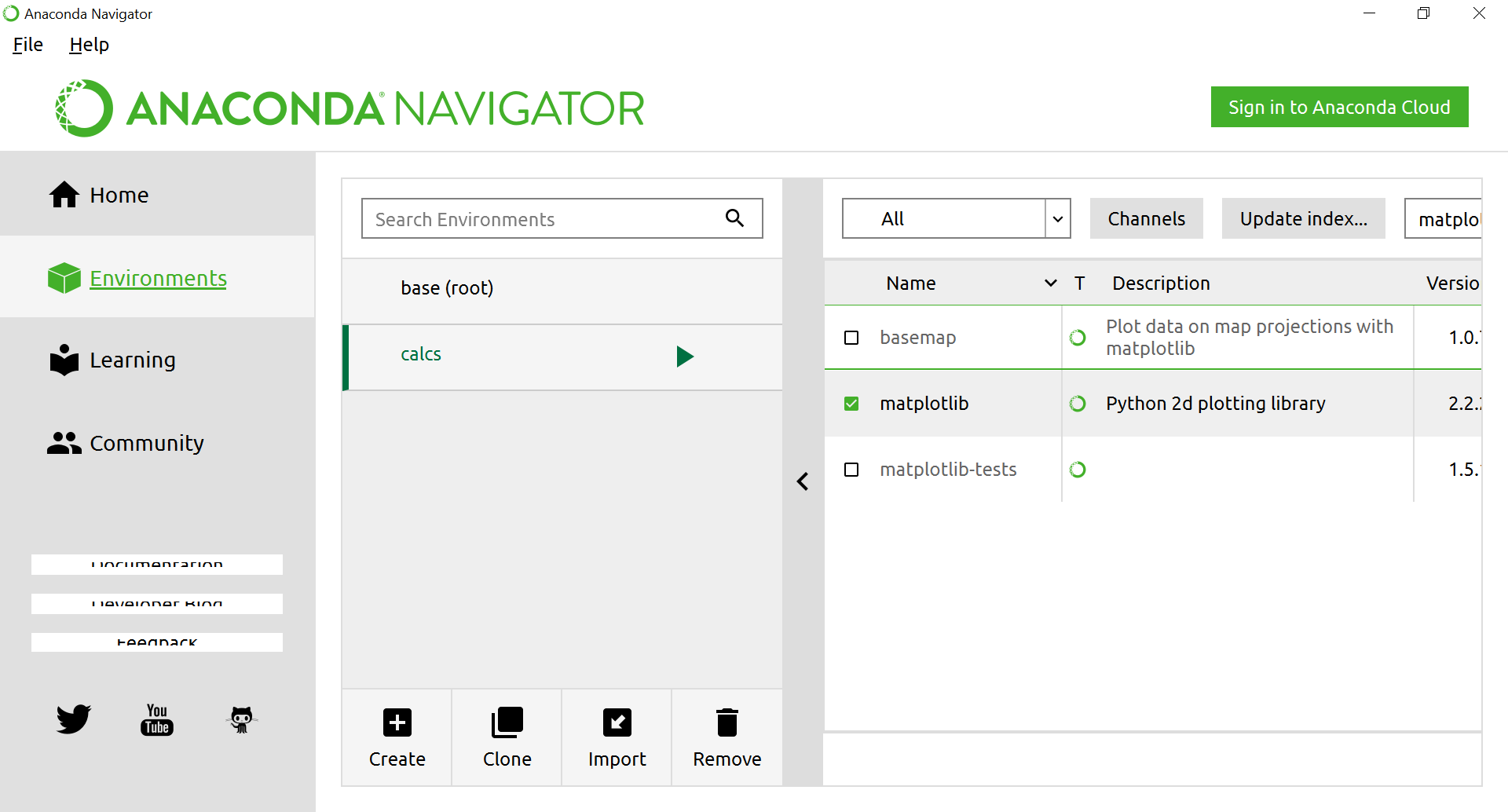
2. Environment setup
Open Anaconda, and create a new environment (I’ve called mine calcs), then install matplotlib. In the Home tab select the calcs environment and launch Jupyter lab, which will open in your web browser (you may need to install it for that environment first). Finally, choose new notebook.
3. Cell type – code or markdown
Jupyter notebooks are able to either run and output Python code or render Markdown (a formatting language which works in a similar way to html). Choose markdown for your notebook headings and explanations and code for, well, Python code.
Thus your calculations can be performed in Python, but you can format and present them in a visually appealing manner. Check out Dillinger for examples showing markdown code and its rendering side by side – it is very simple.
Click the ‘play’ button to run the cell – markdown cells render the text, and code is run by Python.
4. Inserting Free Body Diagram images
Free body diagrams can be much more useful than a description, and are sometimes essential in defining an engineering problem. You could use any diagramming software but in this case I’m using a free online app at https://www.draw.io/. In a markdown cell, use the follow code to display an image (located in the same folder as the notebook in this example:

5. Mathematical functions in Python
Basic mathematics such as addition, subtraction, division and multiplication can be done using the standard Python library. Be aware that the way python handles numbers may not be what you expect – you may get rounding errors with decimal fractions due to the way the numbers are stored and computed – see the python docs for details.
You’ll need to import the math module for slightly more advanced maths such as trigonometry, but it is very obvious in its usage, for example to calculate the slope angle of the track using the math module inverse tangent:
math.atan(1/75)
6. Writing mathematical notation using Latex
Python code is written as basic monospaced text and therefore it’s not as easy to read equations and formulae unless they are very basic. An advantage of using Jupyter notebooks is that you can display mathematical notation using latex (the standard way of writing maths in academia).
In a markdown cell, enter latex enclosed by $$, and after running the cell it will be rendered, such that:
$$v^2 = u^2 + 2as$$
$$v^2 - u^2 = 2as$$
$$a = \\frac{v^2 - u^2}{2s}$$
Is displayed as:
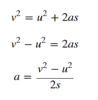
In this method, you’ll also need to enter the same formula in Python too to compute the result, but it is possible to combine them using a module called sympy.
deceleration_slope = (((SPEED_2/3.6)**2) - (SPEED_1/3.6)**2)/(2*(DISTANCE_2-DISTANCE_1))
7. Visualization with Matplotlib
Now we’ve shown our formulas and calculated the result, we need to plot this on a graph, using the matplotlib module.
Once we’ve imported matplotlib.pyplot, basic setup is fairly intuitive, with the title, x and y labels. To plot the data, we just need to do plt.plot with the first argument being the x data points as a list or numpy array, second argument being the corresponding y data points, and the third argument being the colour of the curve and the mark for the data points can also be added. These can contain any number of plots on the same axes, here we’ve shown the maximum braking distance curve v in red, and the calculated brake distance as a blue asterisk. I’ve also highlighted this data point with a text note.
plt.plot(CURVEV_DISTANCE, CURVEV_INITIAL_SPEED, 'r')
plt.plot(stopping_distance, SPEED_1 / 1.61, 'b*') # convert spped into mph
plt.xlabel('Stopping Distance (m)')
plt.ylabel('Initial Speed (mph)')
plt.title('Compliance of Runaway Freight Train Braking performance to GMRT2043 standard')
plt.text(480, 50, 'Braking Event') # first two digits are x and y co-ordinates of the label
After the setup we just call plt.show(), and for Jupyter labs to render this below the code we need to add
%matplotlib inline
at the top of the cell. Matplotlib is very powerful with many advanced customizations (excellent documentation and examples at website), but this gives you an idea of how easy it is to get started.
8. Summary
In this post we can see how powerful the Anaconda distribution of Python is. We can set out our problem clearly by using an image and displaying our formulae in mathematical notation, performed the calculations in Python code and graphed the output using matplotlib – all from within the Jupyter notebook.
As an added bonus if you push your Jupyter notebook to Github, it will render the markdown and compute the code, making it very easy to share!
Leave a Reply